Consulting your data.
Everything you record is uploaded and processed. This page explains every view in the app and the portal, and what each number on it means.
Where your data lives
Everything the insoles record is uploaded and processed. You can reach it in two places: the Data tab in the app, and the online portal at portal.ceriter.com, which gives you more options for reviewing historical data.
Trend view
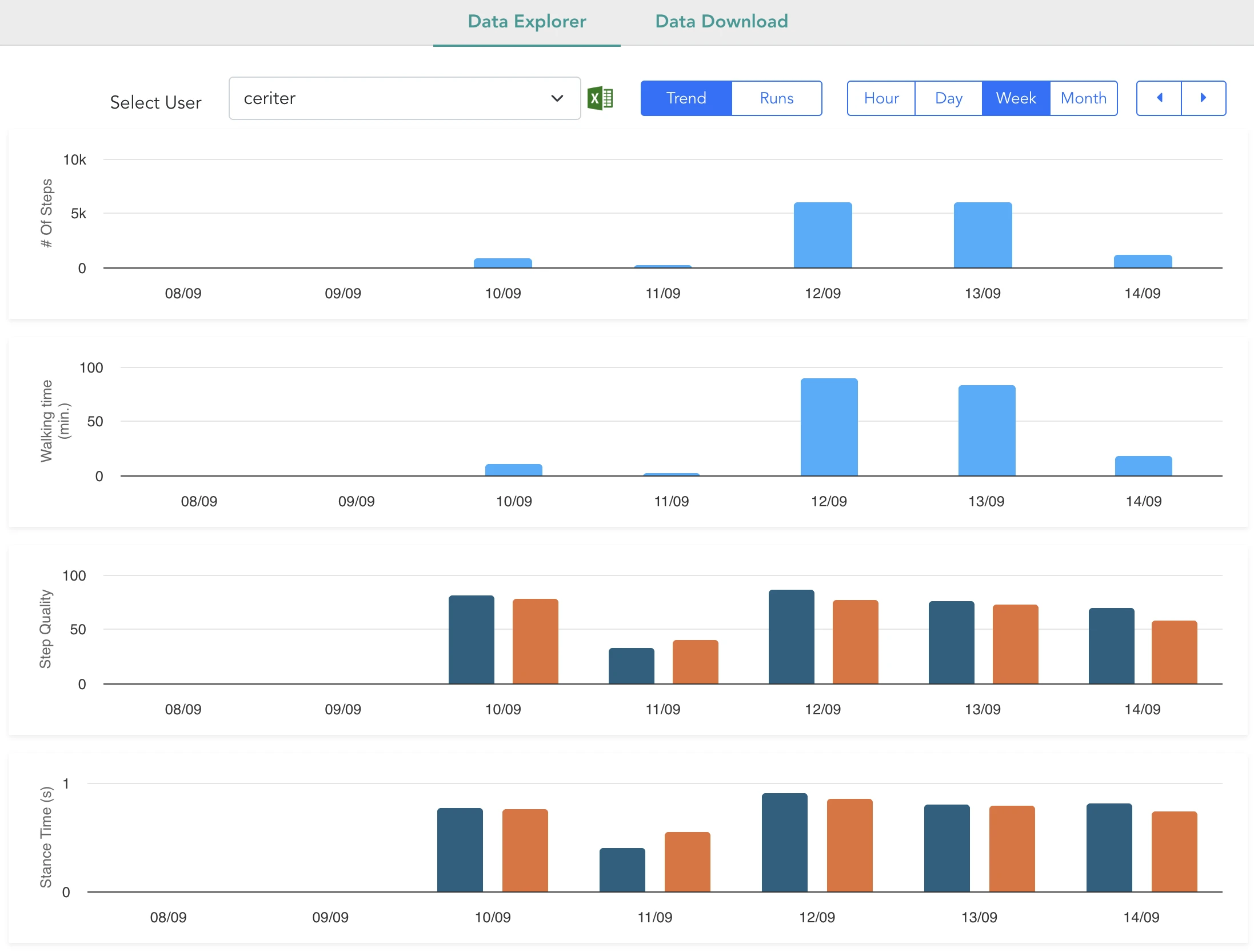
The default view. It shows your progress over time, one point per day, for four measures:
- Number of steps
- Effective walking time
- Step quality score
- Average stance time
Each of these is defined in the sections below. Click any bar to drill down to the five-minute level.
Runs view
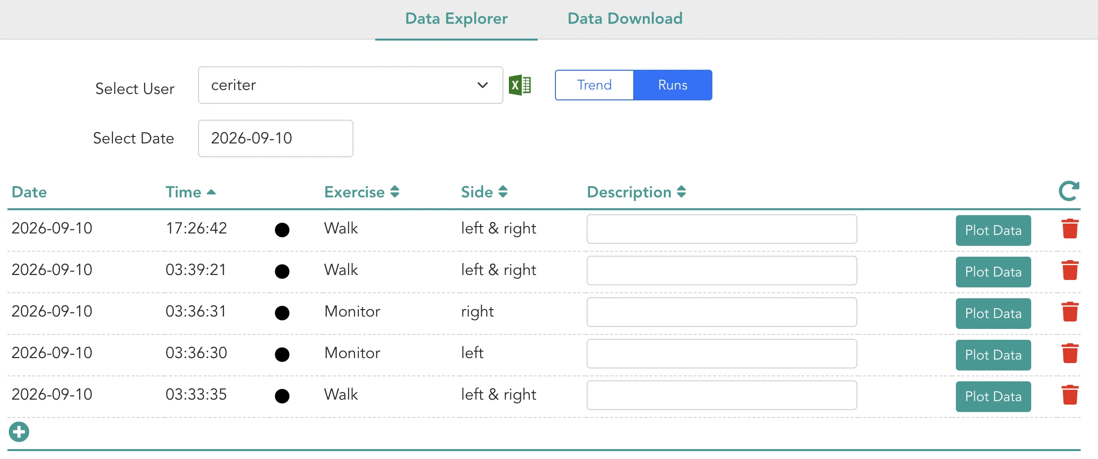
If you use streaming mode, a Runs tab appears, giving you the detail of individual streaming sessions. It shows the effective recordings per day — note that the app only shows recordings from the current day, while the portal keeps the history.
For each recording you can edit and save the description, and download a PDF with the details. Clicking Plot Data loads the detailed views described below.
Load distribution
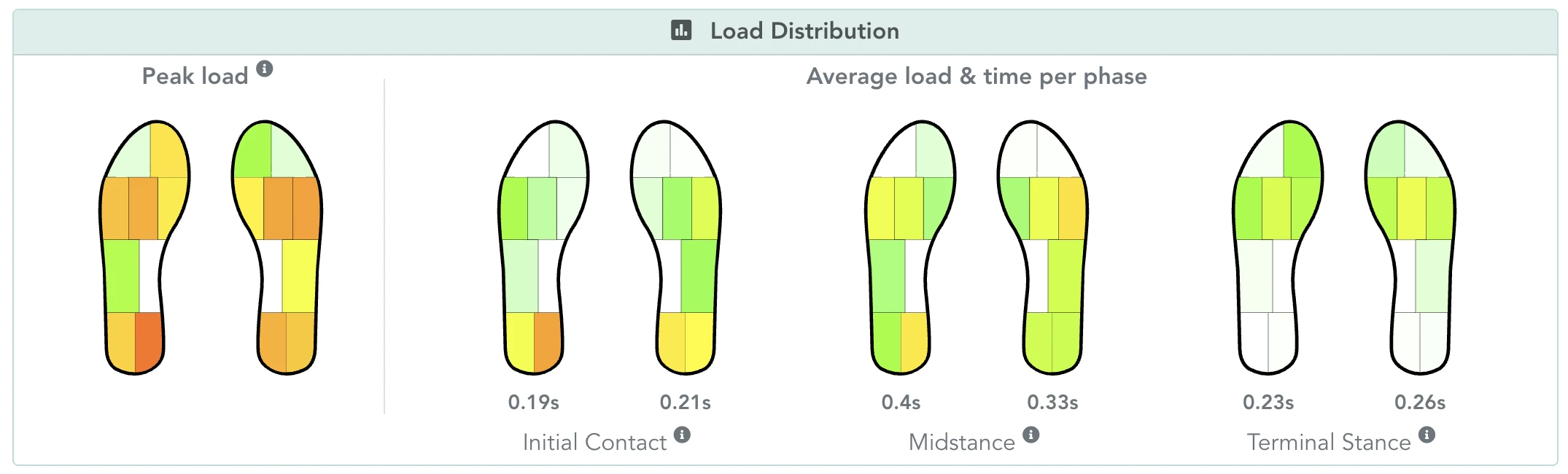
This graph shows how load is distributed across the different zones of your feet while you walk.
Peak load. Move your cursor over a zone to see the average peak load recorded in that zone across multiple steps. Higher values mean the zone carries a greater peak load during walking.
Stance sub-phases. These are the parts of the step where your foot is in contact with the ground:
- Initial contact — from when your foot first touches the ground until your other foot lifts off.
- Midstance — when your foot is fully on the ground, until the heel lifts off.
- Terminal stance — from heel lift-off to full foot lift-off.
For each sub-phase, hovering over a zone gives you the average pressure in that zone, and the average time spent in the sub-phase is shown beneath each insole. Together this shows how the foot is loaded through the step, and whether that loading is symmetrical.
Pressure profile
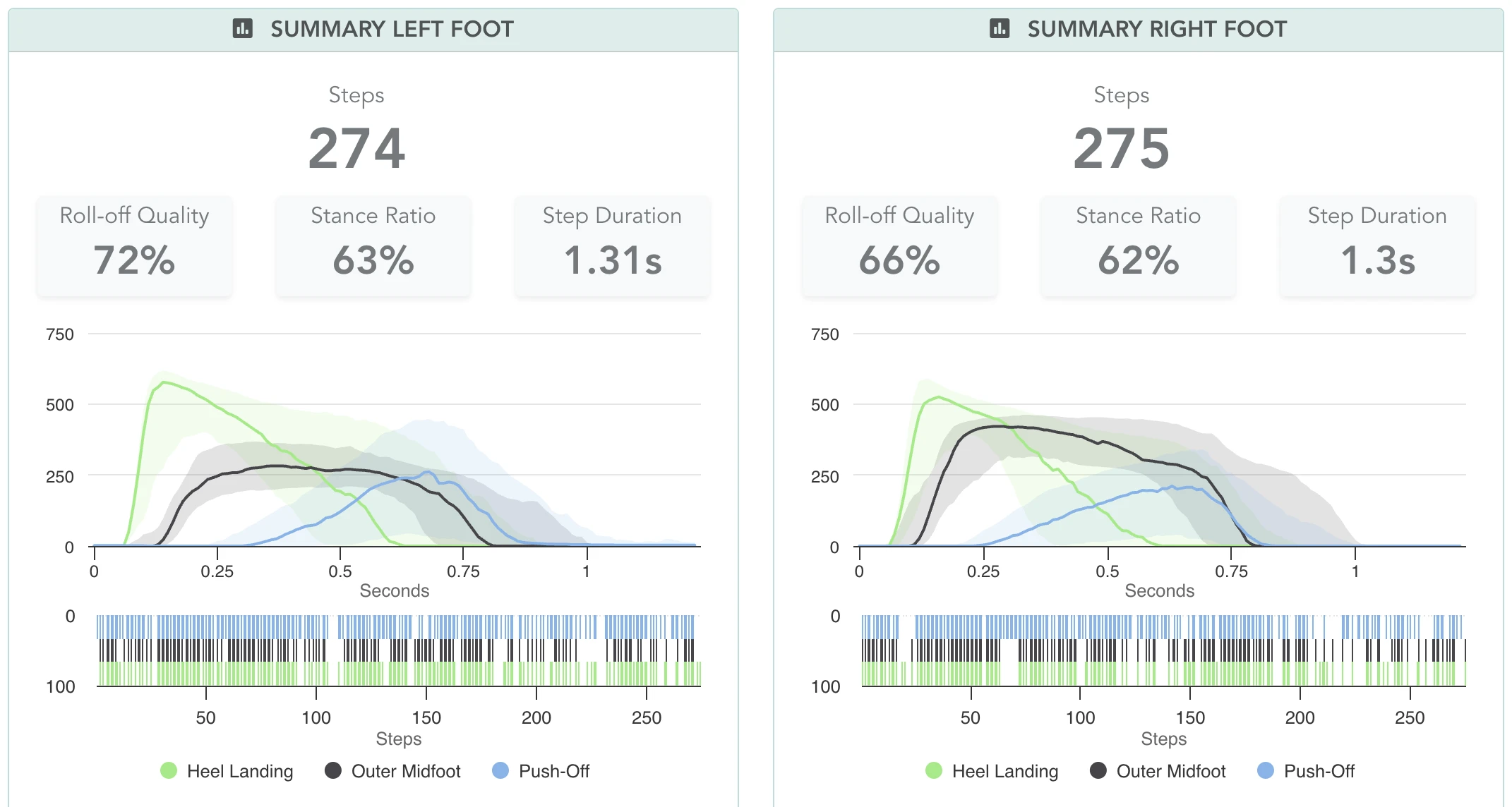
This graph shows the median pressure pattern across every step in the recording — in other words, a typical step. Each line is one zone:
- Heel — green
- Outer midfoot — black
- Push-off, the inside of the front of the foot — blue
Roll-off quality
Three criteria decide whether a step counts as a good one:
- Did the step start with a heel landing?
- Did the foot roll from heel to outer midfoot?
- Did the step end with a correct push-off?
Every step is judged on all three — those are the coloured bars. Roll-off quality is the average of the per-step scores.
Why this matters
This graph shows whether pressure moves through your foot in a consistent and expected pattern. Three things are worth looking for:
- A clear progression from heel to midfoot to push-off in the line graph.
- All three coloured blocks appearing consistently, step after step.
- Noticeable differences between the left and the right foot.
Gait phases
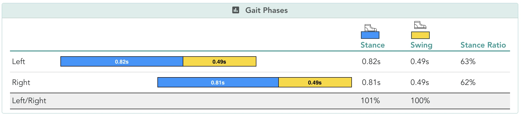
This graph splits each step into its two main phases:
- Stance — when your foot is on the ground.
- Swing — when your foot is in the air.
You get one bar for the left foot and one for the right, each showing stance duration and swing duration in seconds. Beside the bars is the stance ratio: the average proportion of the step spent in stance.
Why this matters
These numbers describe the timing and the symmetry of your walking. Similar values between the two feet usually indicate a symmetrical walking pattern.
Session overview
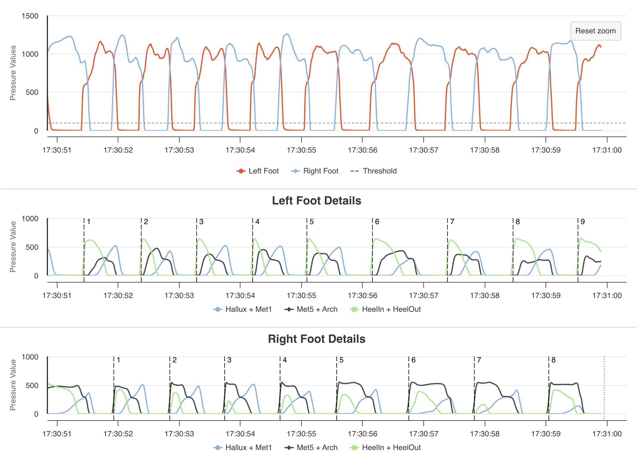
This graph shows how pressure changes across an entire walking session. The horizontal axis is total session time. The vertical axis is the sum of the pressure values from all sensors on each foot.
Those values are unitless. They do not represent kilograms or force, and should not be read as though they did.
Left and right foot details
Clicking Left/Right foot details shows each foot separately, with the pressure in each zone — heel, outer midfoot, push-off — across the full session and for every step. In these graphs you can:
- Click a zone in the legend to show or hide it.
- Click and drag across the graph to zoom into a specific period. When you zoom, the walking characteristics are recalculated for the window you selected.
What these numbers are not
Stride One is a monitoring device. Everything on these screens is a record of what was measured. None of it is a diagnosis, a detection, a prediction, or a recommendation, and none of it replaces an appointment, an examination or your clinician’s judgement.
The pressure values are relative and unitless throughout. Stride One does not measure calibrated absolute pressure, and it does not measure gait speed, walking velocity, step length, stride length, step width or skin temperature.
The app’s daily Stride One Score and the Balance, Roll and Footprint indices are explained on reading your data. If you are taking any of this to an appointment, what to tell your clinician covers how to explain it. If something here is unclear, write to support@ceriter.com.